AI-Assisted Prototyping for Medical Cannabis eCom

Company

Medical cannabis marketplace

Role

UX/UI Designer

Timeframe

August 2025

TL;DR

Tasked with creating a UI prototype of medical cannabis marketplace, I experimented with 4 AI design tools, comparing functionality, UI quality and workflow integration.

Created a website and print materials for an urban festival at a small town in Russia, adapting and developing an existing corporate identity and coordinating with the creative team daily to follow the dynamic timeline

AI-Assisted prototyping and exploration

🎯

Task

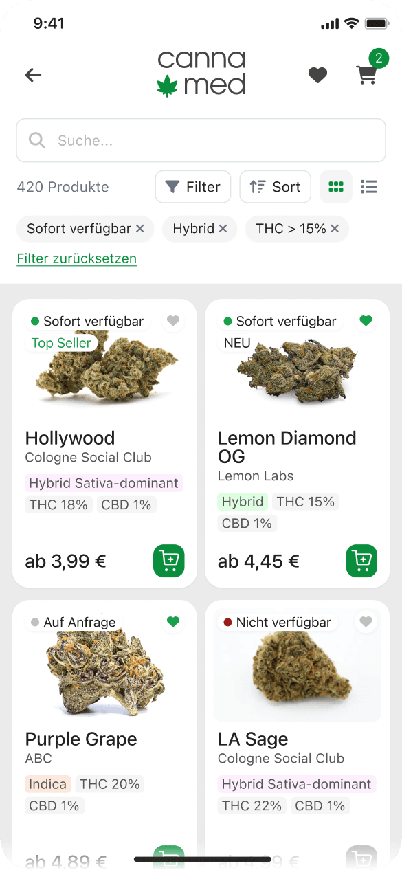
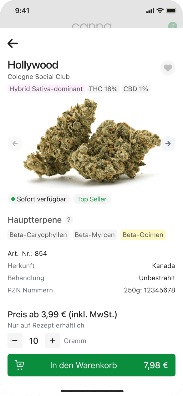
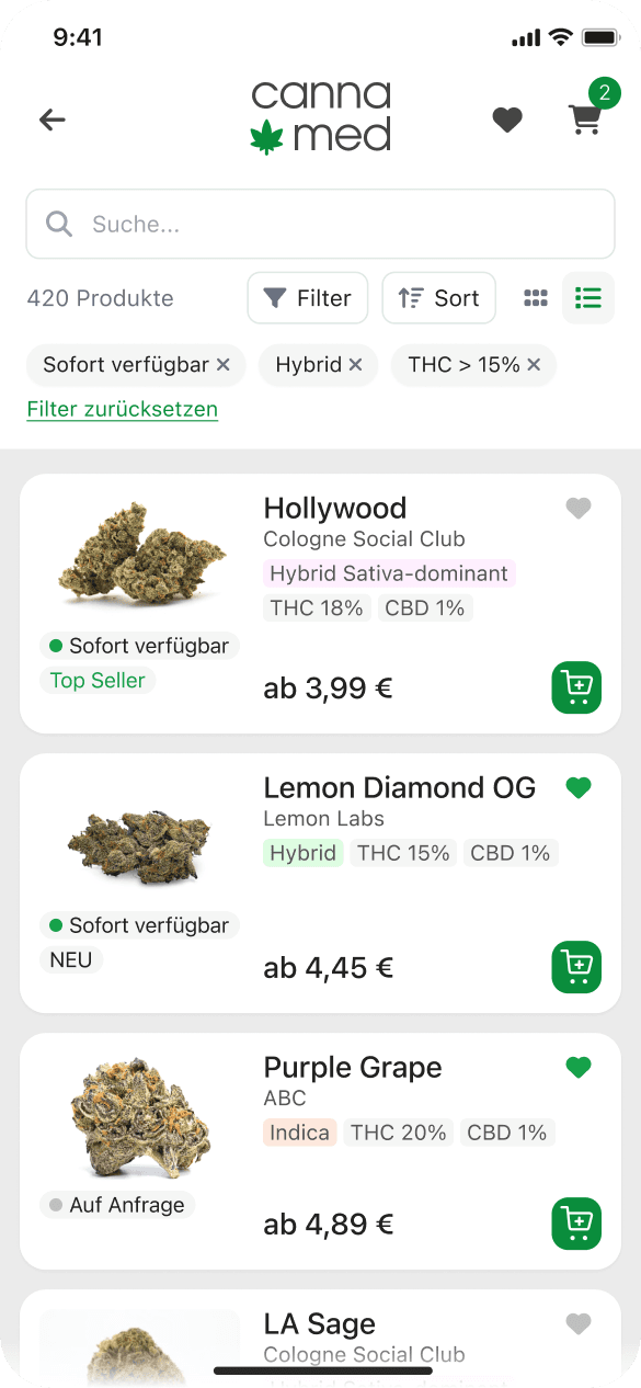
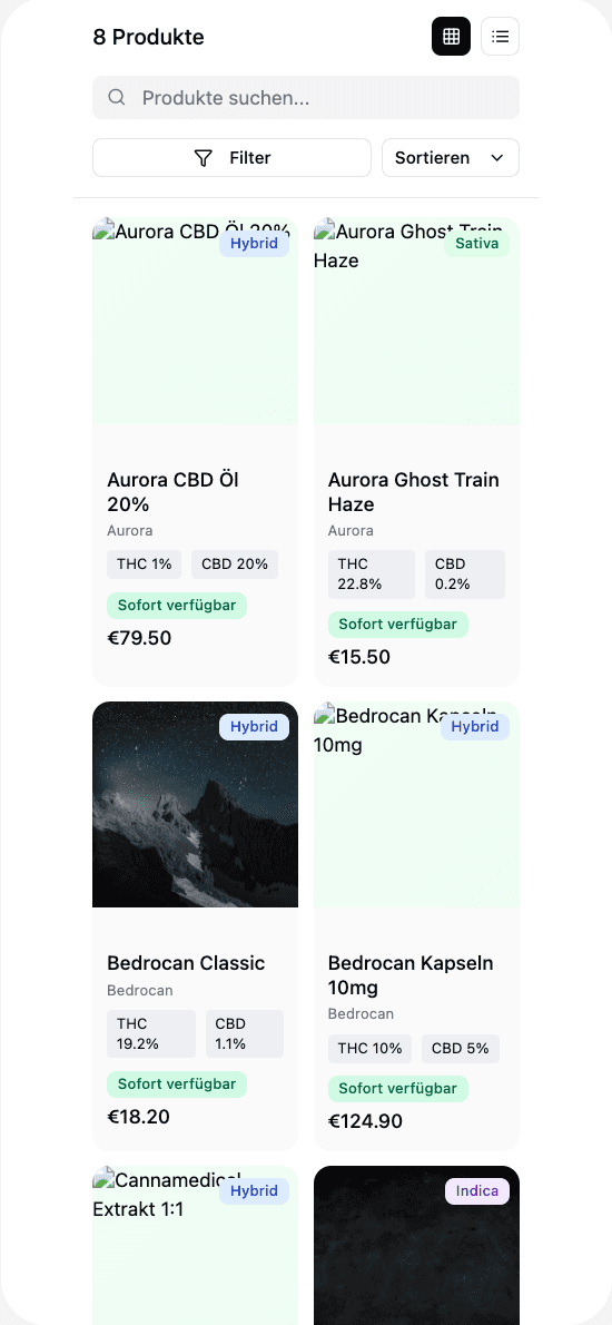
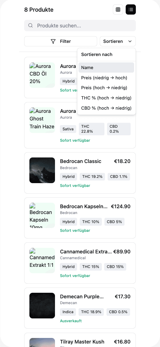
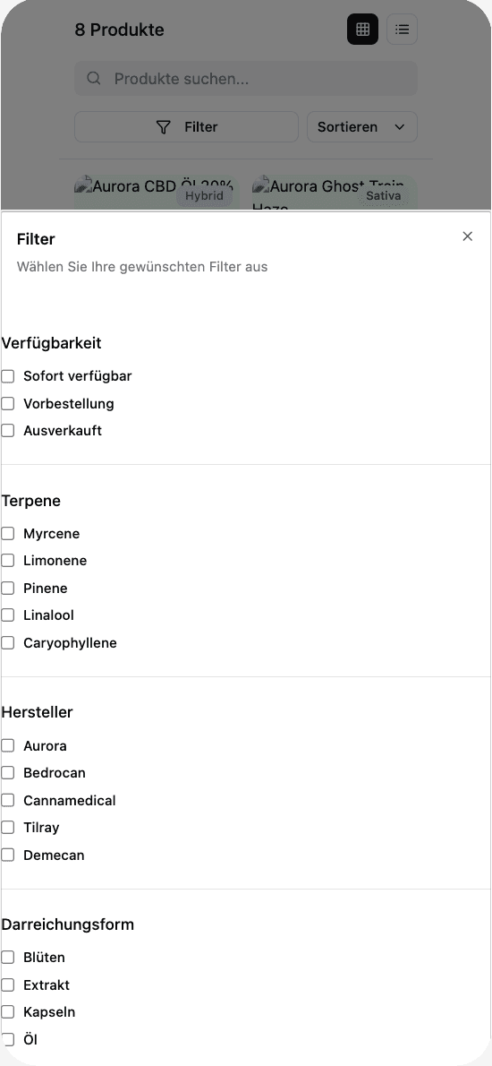
I was tasked with designing a mobile UI prototype for a medical cannabis internet shop: a catalogue with grid and list views and a product page. Rather than starting from scratch, I used it as an opportunity to test how different AI prototyping tools handle typical e-commerce interfaces.

👨🏻‍💻

Process

01

I've started with collecting the key UI requirements, researching competitors' and best practices for mobile ecom ux/ui.

02

Then got ChatGPT to generate a detailed prompt and ran it through four tools: Figma Make, Lovable, Google Stitch, and UX Pilot.

03

I've approached AI output as a starting point for designing my own concept, which had to be delivered in Figma.

04

As a final step, I've assembled the best parts of AI concepts, recreated them in a scalable layout, added a simple brand identity, and added minimal polish.

The entire process took just a few hours.
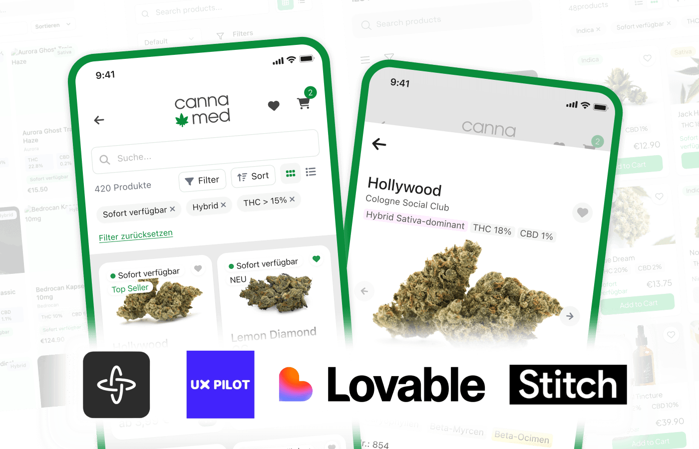
Tools comparison

What follows is a comparison of output by different AI tools.

This exploration took place in August 2025. Given how rapidly AI tools evolve, capabilities may have changed since then.
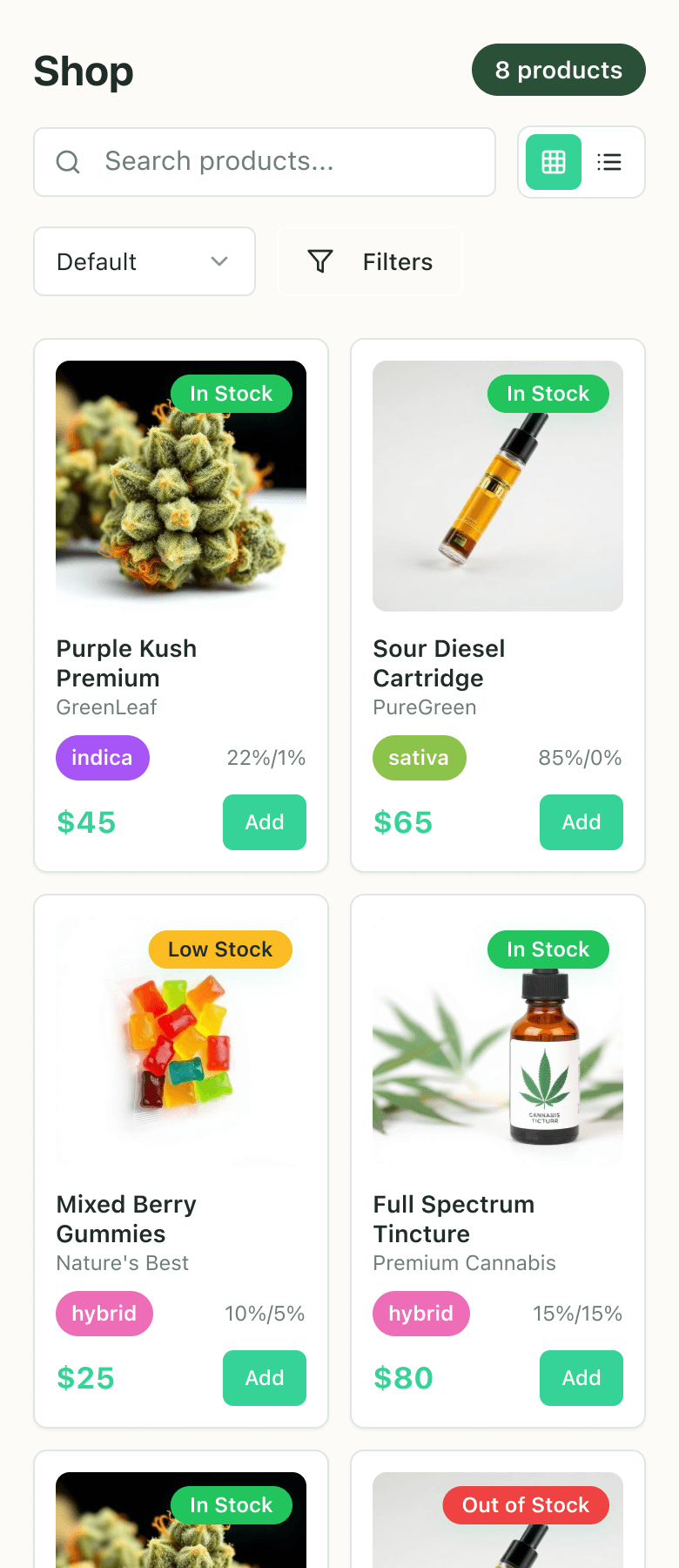
All tools received the same prompt.

Act as a senior mobile product designer tasked with creating a modern, intuitive, mobile-first Shop Grid screen for a medical cannabis ecommerce app. The design should prioritize clarity, usability, and aesthetic appeal, optimized for a screen width of 390px.

🧭 Project Context
This is part of a cannabis ecommerce platform where users browse and explore available medical cannabis products. The UI should support quick scanning, filtering, and easy switching between list and grid views.

🧩 Core Features & UI Elements
Product card layout (Grid view) showing 2 products per row on 390px mobile screen

Each product card must display:
Product name
Type (Indica / Sativa / Hybrid)
Price
THC/CBD percentage
Availability status (“Sofort verfügbar”)

🎛️ Control UI (above or sticky)
Display total number of products
Search field (clear icon inside input field)
Toggle to switch between list view and grid view
Filters dropdown panel, with the following options:
Availability
Sort (by name, price, THC %)
Terpene type
Producer Form (e.g. flower, extract, capsule)
A prominent “Reset filters” button
A “Sort by” button (may open modal or dropdown)

✨ Visual & UX Guidelines
Follow a contemporary, reduced visual language — clear typography, conscious spacing, modern iconography
Maintain strong visual hierarchy and tappable UI targets Include subtle animations (e.g. hover states, image fades, filter transitions)
Use consistent visual elements and spacing across product cards and control bar
Include placeholder areas for logos or signets

📱 Device & Layout
Design for mobile-first experience at 390px width
Use Auto Layout and responsive constraints to support future scaling

✅ Success Criteria
Clean, easy-to-scan layout with legible data and intuitive interactions
Filtering and sorting should feel lightweight and easy to reset
Product grid should support quick product discovery and comparison

View full prompt

Figma Make

✅ Decent visual hierarchy and a clean layout

✅ Handled the requested functionality (list/grid view, filters/sort) pretty well

❌ Failed to generate product images. Not

❌ No Figma file export — only generates HTML code you can't directly copy into Figma Design. Update: this was enabled for paid plans later

Verdict: good for visual reference, but limited for iterative design work.
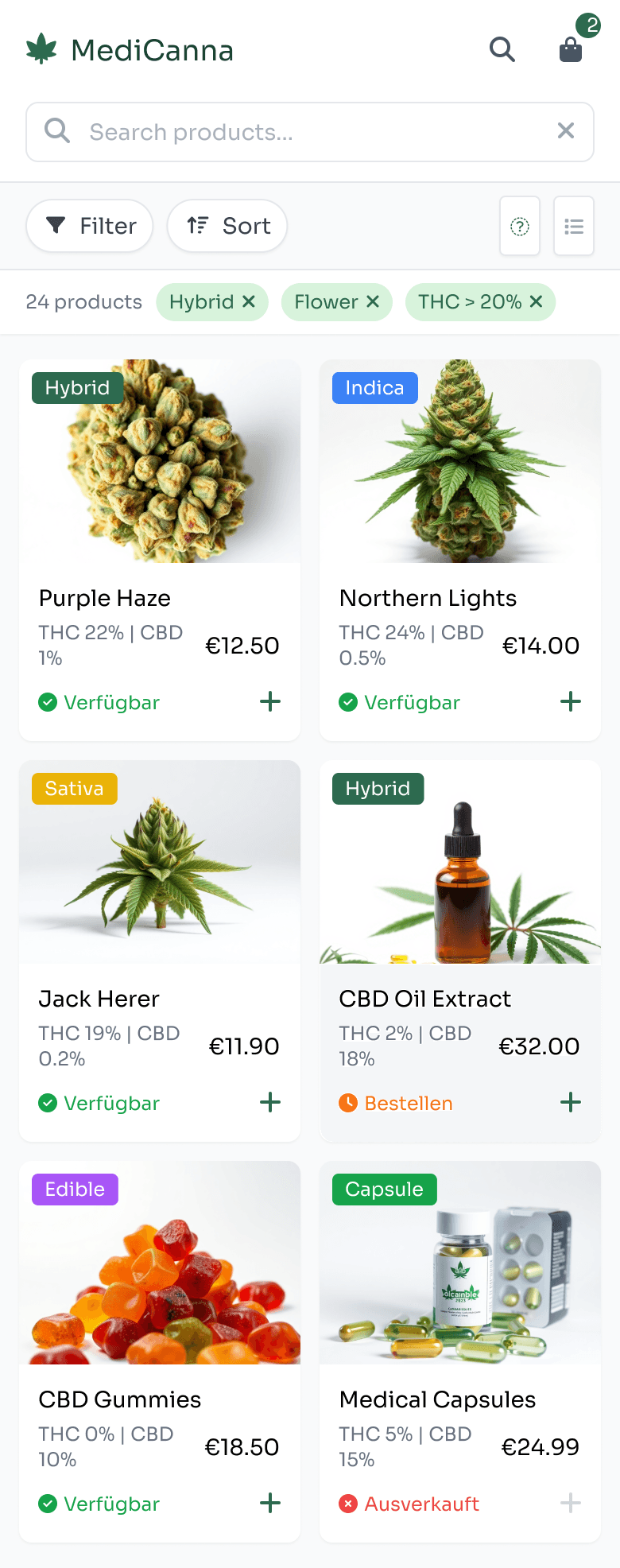
Lovable

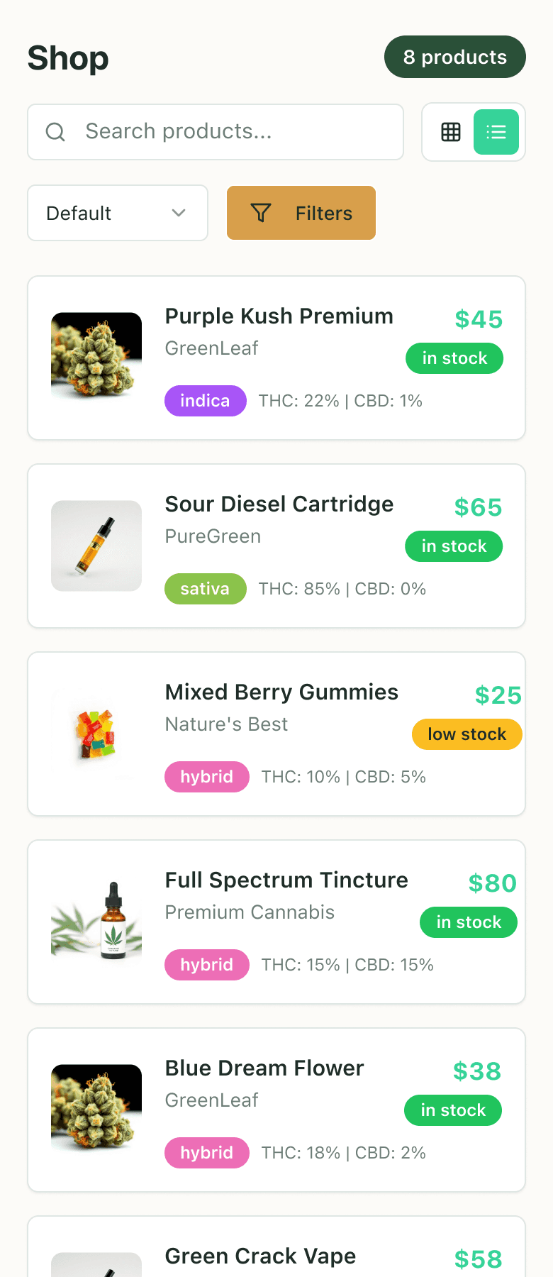
✅ Also did a decent job with regards to functionality

✅ Didn't forget to add the essential "Add to cart" button for each product

❌ Questionable UI quality: too many colors, wrong accents, poor alignment on product cards

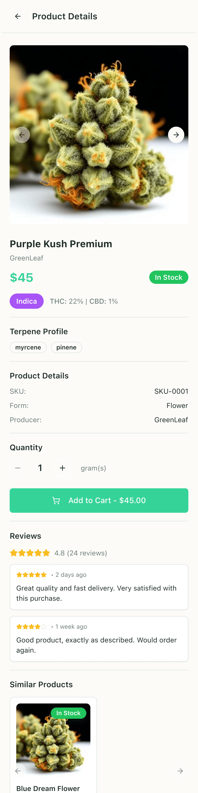
✅ Bonus: generated a functional product detail page after a further request

Verdict: good for functional prototypes / MVPs, experimenting with feature requirements; would need a lot of refinement to reach good UI quality
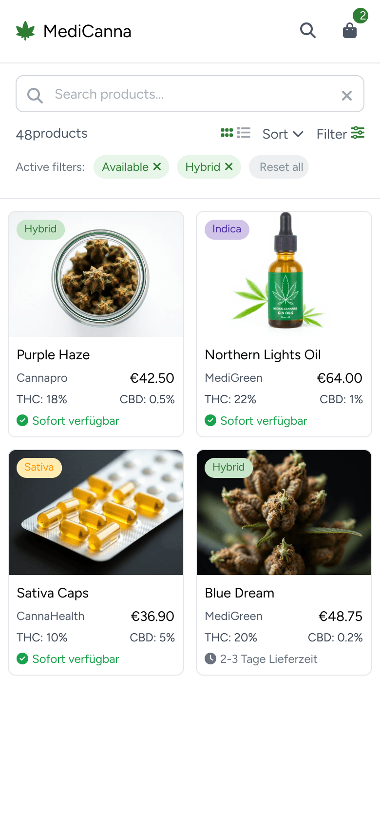
Google Stitch

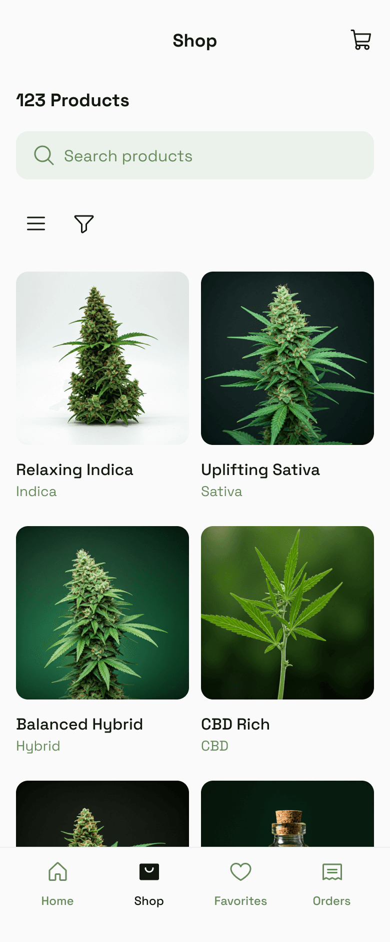
✅ Clean aesthetic with nice color choices and custom typography

✅ Generated product images, creating a more polished look

❌ Missed all the requested details on the product cards (THC/CBD %, availability, add-to-cart buttons)

❌ Didn't implement changes when asked, despite claiming it did

✅ Integration with Figma

Verdict: Works for visual inspiration

UX Pilot AI

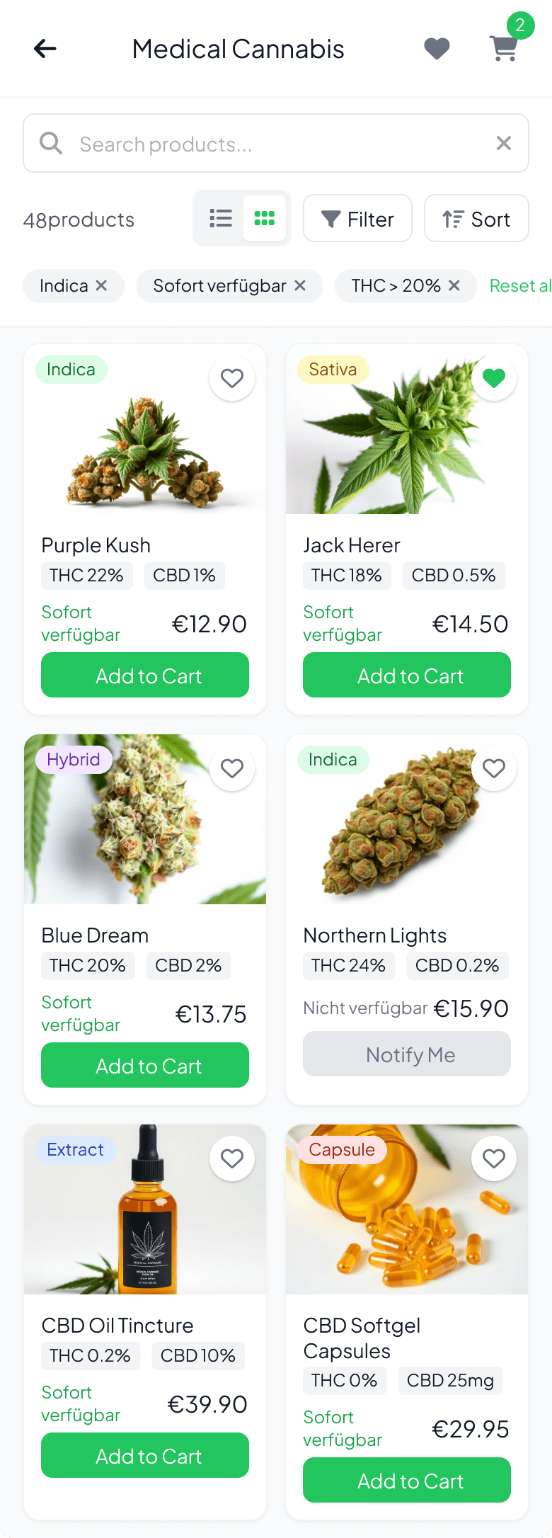
✅ Created three design variants, allowing for comparison (although the setup was a bit confusing)

✅ Good implementation of controls (go back, cart, search bar, activated filters, sort options)

✅ Figma plugin, so the results are directly editable

✅ Attempted logo generation

❌ Didn't generate the list view, and failed to create the product page when requested

🥴 Product images a bit weird

Verdict: Most practical for my task — creating a concept in Figma

How I would rate the tools based on my experience dealing with this task:

UI Quality

Tool functionality

Figma Integration

Figma Make

⭐️⭐️⭐️

⭐️⭐️⭐️

❌ only via html2design

Lovable

⭐️⭐️

⭐️⭐️⭐️⭐️

❌ only via html2design

Google Stitch

⭐️⭐️⭐️

⭐️

✅ easy import

UX Pilot

⭐️⭐️⭐️⭐️

⭐️⭐️⭐️

✅ native Figma plugin

Assembling UI output and finalizing the concept

In the final iteration, I've assembled the AI-generated prototypes in Figma (using html.to.design for Lovable and Figma Make).
Quickly configuring a scalable component-based design with autolayouts and adding a simple branding, I've finalized the concept, mostly using output by UX Pilot and Lovable.

Key Learnings

My takeaway from this experiment is that AI tools can be very helpful for breaking through blank-canvas when dealing with standard tasks. It was great to receive multiple starting points in just 1-2 hours, as if I was working with a very fast junior designer.
Obviously, each tool has different strengths and limitations, and knowing which one to use for which task is key.
UX Pilot has been my choice for getting concepts quickly in Figma since then, and Lovable for building functional prototypes — you can read more about my experience with it in the Travel App prototyping case.
And of course, AI software changes with incredible speed, and the tool-related conclusions from this experiment could get obsolete very fast.

Made on Framer

© 2025

Nikita Chichkin

Made on Framer

© 2025

Nikita Chichkin

Made on Framer

© 2025

Nikita Chichkin